

ESSAY: Spring Term
A Syllabus on Typefaces in Novels


Course Description
Our focus this semester is “Typefaces in Novels,” not to be confused with “Novels about Typefaces.” No, what we’re talking about here are the actual typefaces used in novels, and specifically those little “A Note on the Type” paragraphs that you find at the back of some books. A font is a specific member of a typeface family, so there’s that to clear up, otherwise the class would be “Fonts in Novels,” which honestly has a nicer ring to it than “Typefaces in Novels.”
Before we get going there are, as usual, a few arcanities. Last semester you were all good sports about winding your way through the abandoned, off-campus building where our class was held, and the semester before that you all played nicely despite the peculiar conditions of the class, which involved the library stacks and, of course, the boiler room.
We should not speak again of the shimmering room.
Well, our spring class is no different and has its own unique, shall we say, circumstances, and I ask you once again to indulge me, as your professor, a few words about that before we get to the reading list.
This semester we are back on campus! You’re likely familiar with the old Gindly-Benyovszky Building across from the looming clock tower and adjacent to the Student Services Center. Faculty have been assured by the university administration that the classrooms in this building are back in working order and that the rumors (apparently being spread on a Reddit thread that is probably not even by a student but rather someone probably from Latvia, based on the occasional use of words like ēka and pasniedzējs) going around campus about uncanny noises of a fluttering nature coming from the basement of the building are just that: rumors with “no basis in objective reality,” (I’m quoting here from the Provost’s email.)
Well, apparently some basis in reality, as we all know about the campus May Day ritual involving an esoteric maypole ceremony performed by Hungarian students here on campus in the early 1900s. A refresher: these students reenacted a supposedly playful courtship ritual from the old country wherein the courted young woman in question lights three matches to indicate she’s pleased with the decorated and festooned maypole. The resulting fire that broke out was quickly extinguished but, in the haze of smoke, the young woman disappeared. This happened—sometime between 1912-1919—in the back courtyard of the Gindly-Benyovszky Building which is now, as you know, the site of the campus greenhouse.
To cut to the chase, this is where our class will be conducted: in the greenhouse behind the Gindly-Benyovszky Building. If you wear glasses bring plenty of wipes: humidity. On windy spring days the heavy plastic sidewalls tend to flap spasmodically; if wind gusts are over 50 mph we’ll need to use the Chronotype Book Stabilizers. Bring guy ropes. If you’re allergic to Miracle-Gro Plant Food or Dr. Earth Fertilizer you should drop this section and enroll in Professor Barry’s, as hers is not held in a greenhouse.
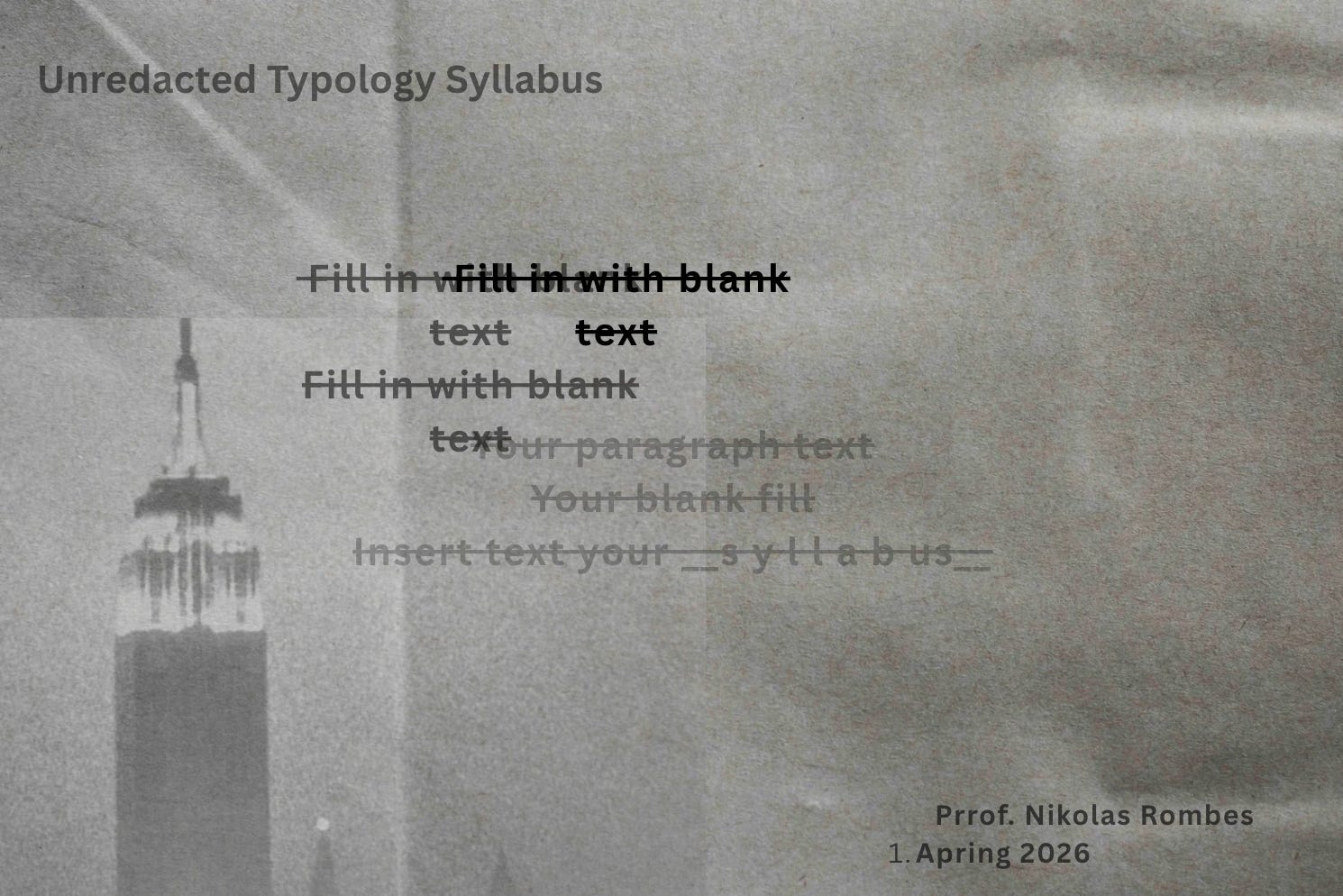
I should also say here there are several—perhaps dozens—of false or “lesser” syllabi for this class in circulation. I’m not sure who is generating these; they seem designed to throw you off the scent. The one below, for instance, either purposefully or accidentally suggests the class is about typology rather than typography. It’s also riddled with typos. Rest assured that the version of the syllabus I emailed each of you directly is the correct one. Be especially wary of versions showing up, not unexpectedly, at Reddit and, more surprisingly, on various Facebook Marketplace sites and, even odder, the United States Department of Agriculture website.
Course Equipment
Our linotype machine weighs over 3,000 pounds so our class sessions involving its use will take place in the cellar of the greenhouse, accessed back where the Hydrangeas are grown. There are actually three below-ground levels; the linotype is located on the deepest: level three. There’s a fairly simple process for accessing this level which I’m sharing here in case I’m late for or absent from class on any of the days we’ll be using the linotype. The process goes like this:
make sure you have secured your backpacks and your headlamps
locate the Hydrangea section at the rear of the greenhouse
turn off the watering hoses
move the geraniums table to access the trapdoor leading to the cellars (4 students who have some arm strength required for this)
open the trapdoor and descend the ladder into the darkness
at the bottom of the ladder step into the cellar (level 1) and activate the lights
locate the next trapdoor on the floor, descend the ladder, and follow the same procedure as above
you are now at level 2; ignore the mold, as it’s not toxic
locate the next and final trapdoor, which you’ll notice is significantly smaller than the other two
open the trapdoor and descend the ladder (you may need to raise your arms above your head to squeeze through the entrance)
you’ll notice this is a much longer descent
you are now approximately 300 feet beneath the greenhouse, at level 3
plug in the generator in the corner, activate the fluorescent lights, and make your way to the linotype machine
in a blue metal box beneath the linotype are instructions for how to start the machine (again, in case I’m absent)
if you happen to see—and this is extremely unlikely—a red metal box, do not open it, under any circumstances
once the linotype is up and running, stand back as the machine will likely backfire a few times before running smoothly
Class Schedule
Week 1: Minion
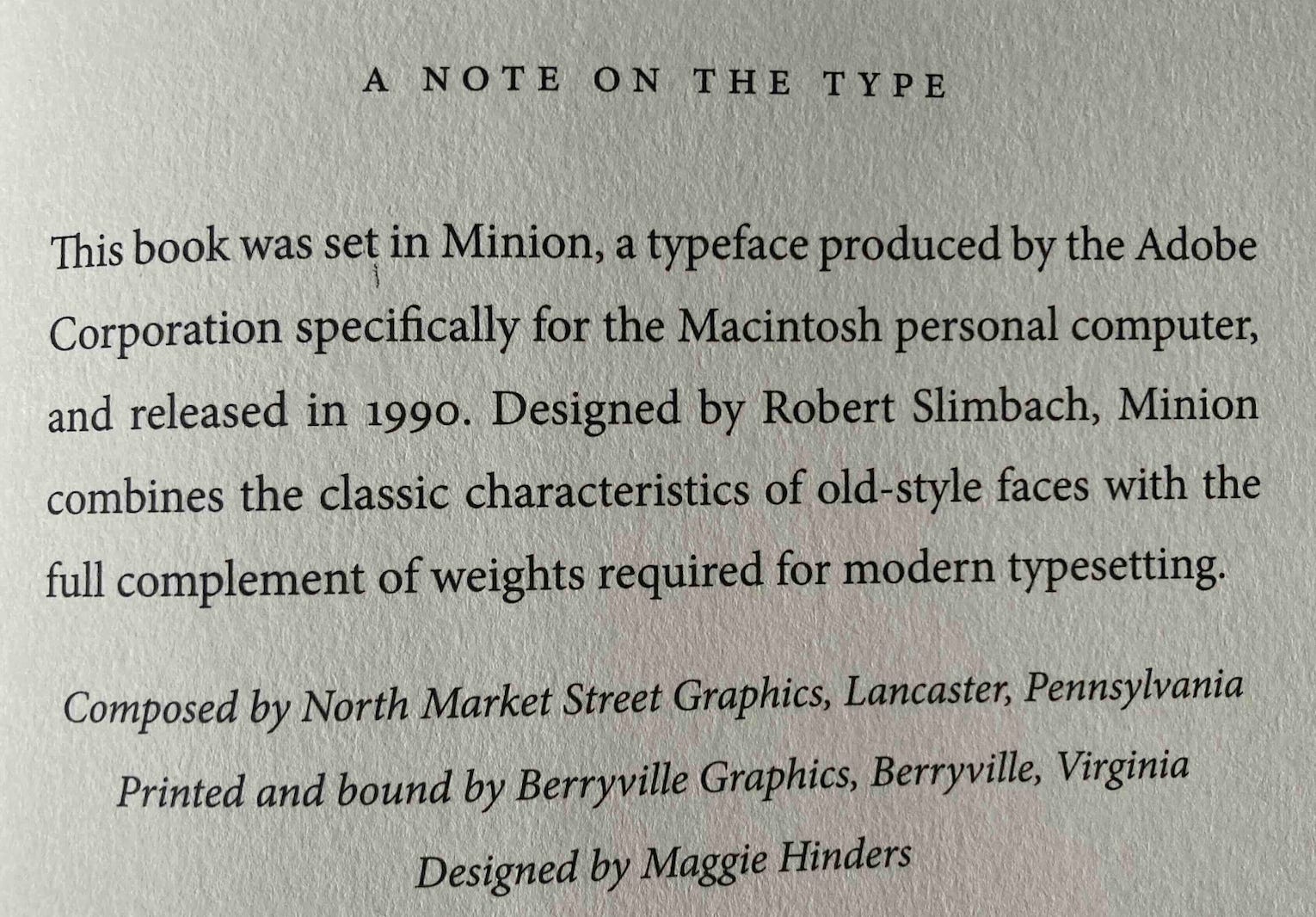
You wouldn’t think it, but Minion, as harmless as it seems, has its detractors. Matthew Butterick, author of Typography for Lawyers, has this to say: “I have an irrational prejudice against Minion” and “Minion succeeds so well in being noncontroversially good-looking that I find it sort of dull.” There is quite a passionate debate about Minion and its virtues. And yet, can we admit the simple elegance of Minion for Ishiguro’s novel, how it carries along lines like this, narrated by Klara, the Artificial Friend, in Klara and the Sun:
Now I was more accustomed to riding on Rick’s back, I often reached out a free hand to help part the grass. Not only was the grass more yellow than on our previous journey, it was more soft and yielding, and even the clouds of evening insects broke kindly against my face as we passed through them.
The fact that these words are set in Minion means something, something hard to articulate but important. This difficulty gets at the heart of this class: how is our experience of reading shaped, invisibly, by typeface? And when you look upon each other’s faces, students—with kindness—what do you see? Are you open to the possibility that the face you are looking at hides some deeper sadness? You are not unfamiliar with such sadness, am I right? We each carry and present our own unique type-faces, conditioned by expectations beyond our control. In one of her letters to Susan Gilbert, Emily Dickinson writes, “Oh Susie, I would nestle close to your warm heart, and never hear the wind blow, or the storm beat, again. Is there any room there for me, or shall I wander away all homeless and alone?”
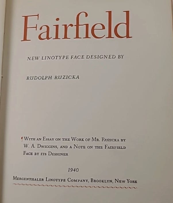
Week 2: Fairfield
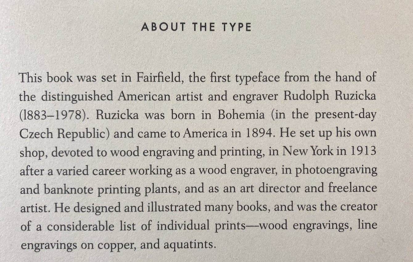
Can we please go back to the days when new typefaces were often announced in little booklets?
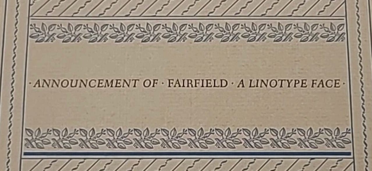
In class we will fall under the black spell of Mariana Enriquez’s Our Share of Night. There are passages in her novel that are not just about paranoia but are themselves paranoid, such as: “Adela shimmered under that artificial light. Gaspar felt like they were in a theater: he knew he was being watched,” and “Gaspar knew he was in his room with his uncle or his friends, but he felt like he was somewhere else, and everything was familiar and unknown at the same time.” Like the myelin that protects the electrical currents in the nervous system, the Fairfield typeface somehow protects Enriquez’s words from falling into a disorganized, entropic state. To read Our Share of Night in any typeface other than Fairfield would be to bring upon ourselves the most terrible punishment.
Week 3: Perpetua
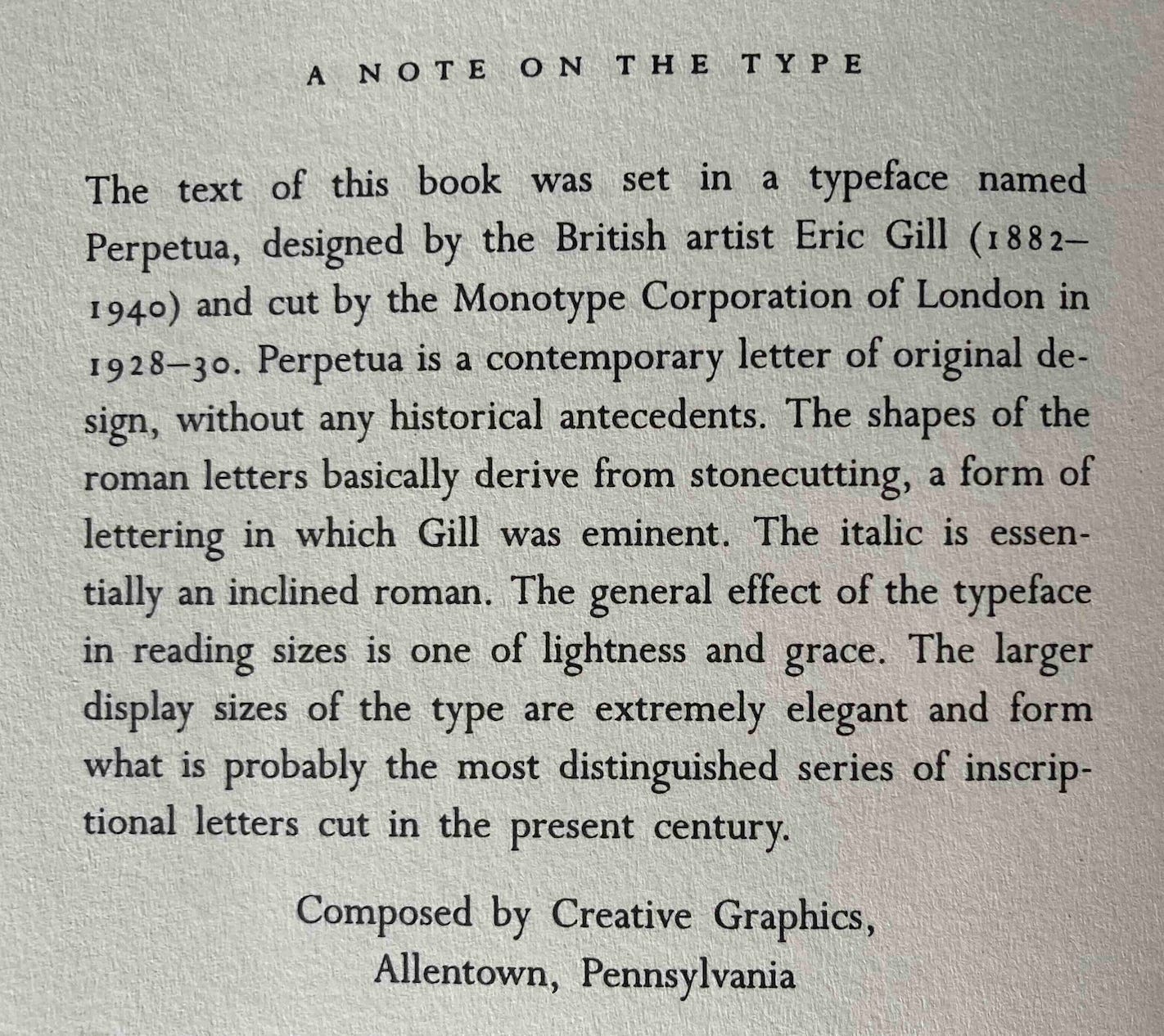
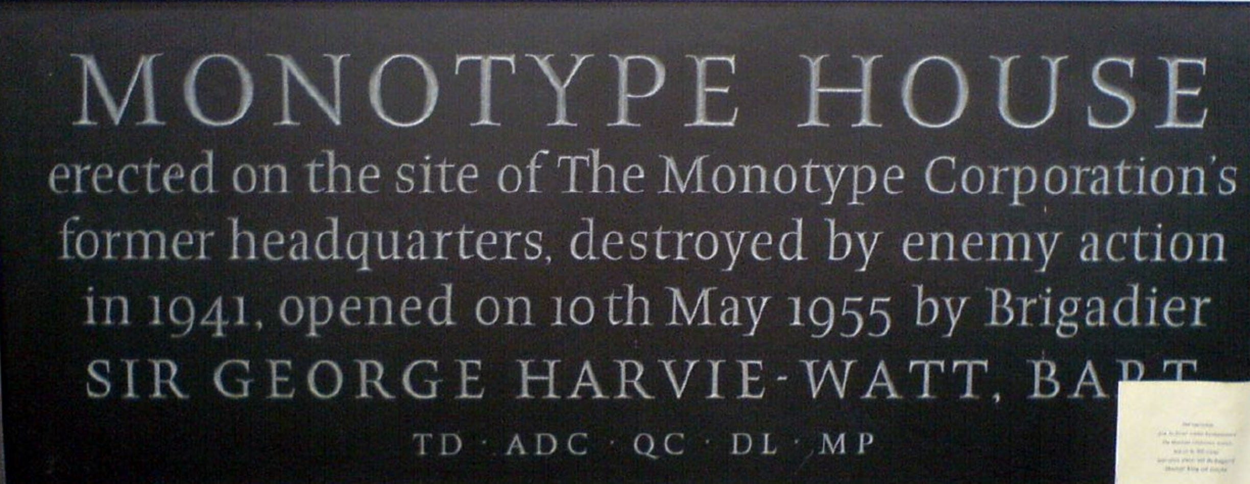
Good old Perpetua. There is so much obscure history packed into these little “A Note on the Type” sections you find in some novels, mostly hardbacks. Perpetua’s designer Eric Gill, for instance, sexually abused his two daughters and his pet dog. Although these facts about Gill have been known since 1989 and the publication of Fiona MacCarthy’s biography, the Marcus book makes no mention of this. Why not? Lightness and grace. Extremely elegant. Distinguished. These are the adjectives used to describe Eric Gill’s typeface, Perpetua. They are not the adjectives used to describe his life. The Monotype Corporation mentioned in the “Note on the Type” was destroyed during the Blitz in May 1941. A darkness radiates outward from Perpetua.
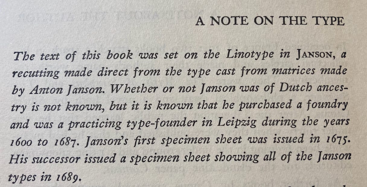
Week 4: Janson / not-Janson
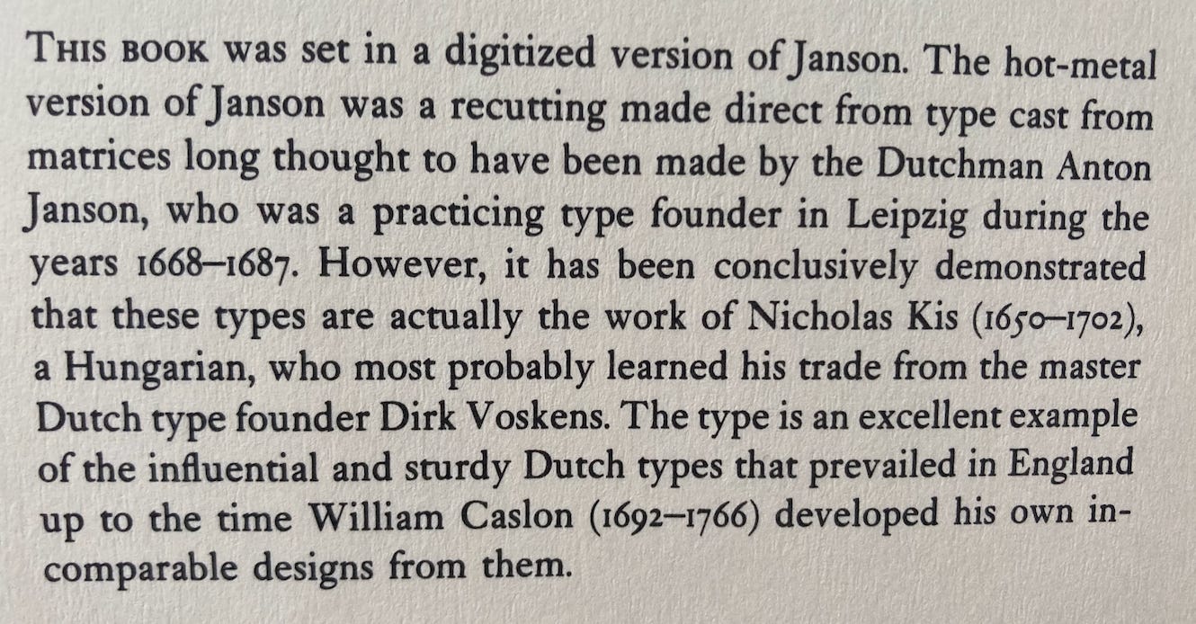
The level of intrigue in this description of the Janson type might itself be the plot outline of a lost le Carré novel: we learn that the Janson typeface we attribute to Janson was actually designed by the Hungarian-Transylvanian schoolmaster and punchcutter Nicholas Kis; Dirk Voskens may have had a hand in its design, too.
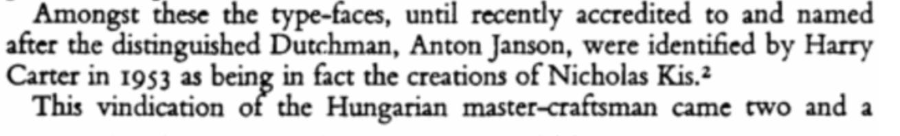
Books published up through the 1950s (see image below) didn’t refer to the Janson-Kis imbroglio, although some of them, as below, were uncertain about other matters, such as: was Janson even a Dutchman to begin with? It seems like the more we know about Janson, the less we know about him.
Week 5: Comenius
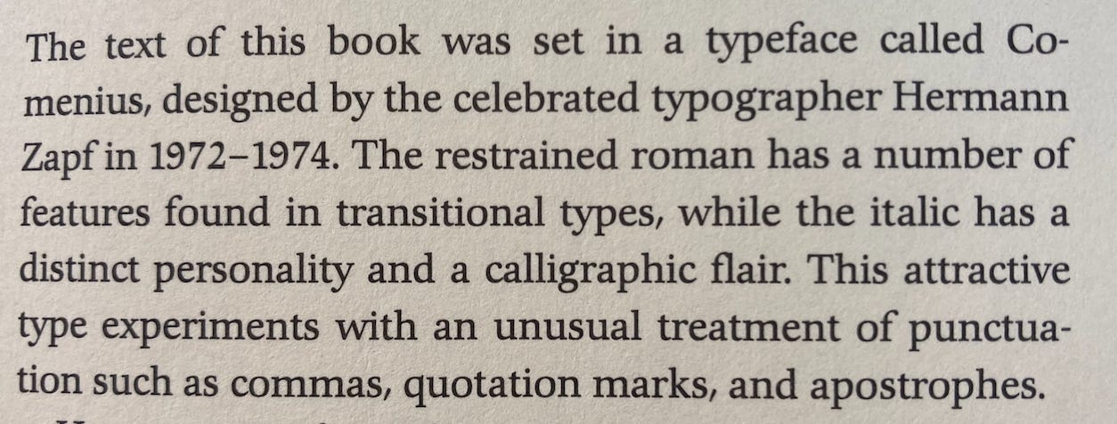
Among the strange and mysterious elements of these “A Note on the Type” paragraphs is that they are anonymous, one of the few parts of a book not attributed to an author, an editor, a designer, a printer, or a cover artist. There is something Westminster Kennel Club Dog Show-like about the Comenius description: distinct personality and attractive type. Hermann Zapf also designed the Palatino and Optima typefaces. Almost all “A Note on the Type” paragraphs begin either with the phrase “The text of this book” or “This book was set,” leading one to suspect an invisible hand behind them all, an undying, anonymous auteur who wrote each and every one of these.
Midterm Exam (Take-Home)
Option #1
Pen your own “A Note on the Type” for the novella you are writing. Invent your typeface with the Typeface GeneratorXlevel© package you subscribed to when enrolling in this class. Whatever genre you are working on through your novel (remember: autofiction is forbidden), find and follow that same voice in your “A Note on the Type.” For instance, those of you writing in the cosmic horror vein might consider cap lines that result in bleeding eyes upon reading, while those of you whose novels hearken back to the Kmart realism of the 1980s might consider a “dirty” typeface that stains the reader’s hands, thus giving the impression of a hard-working, manual labor sort of implied author. For those of you working on a dark academia novella, avoid the obvious traps (a Gothic-derived typeface; a typeface mirroring Cloister Old Style, used in Donna Tart’s The Secret History). Word length for this option between 8,000-10,000 words.
Option #2
Design a non-transgressive billboard in a transgressive typeface. Our inspiration here is one of the very few movies that feature a billboard painter: Terrence Malick’s Badlands (1973), starring Warren Oates as said painter.
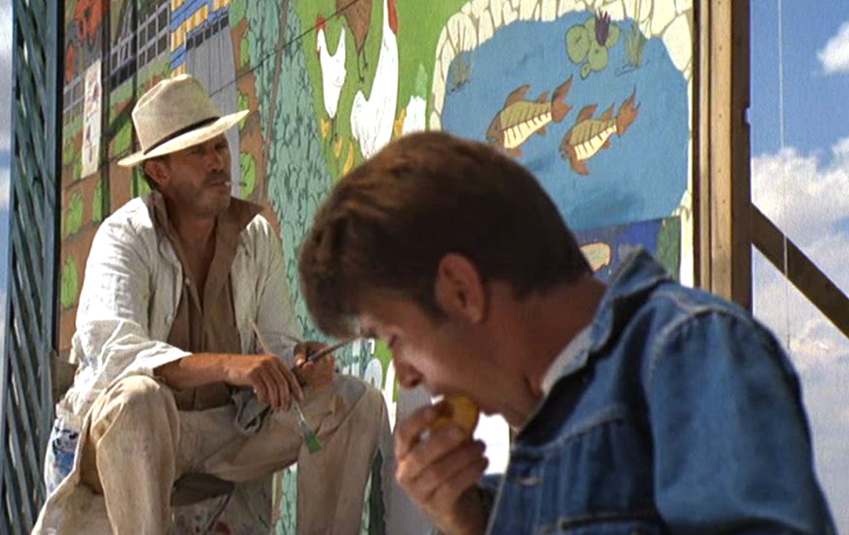
Painting supplies and oversized canvases provided, as well as the type of optical device, likely a camera obscura, said to have been used by Vermeer. Do you remember those childhood days with no sense of time when you made tents and tunnels and small hiding pockets out of sheets and blankets draped across furniture, your own internal fortress against the looming adulthood you imitated with your play-acting, and yet feared? This is the wavering feeling you will recapture while creating your own camera obscura, a device you’ll use to redirect the light and reverse the image onto your “collecting point” or “treasure house,” terms we will use to describe where light collects on your billboard canvas. But forget all that for now. The final part of this Midterm option involves the installation of your billboard along Route 2, in the dark of the night, by lantern light.
Week 6: Tibere
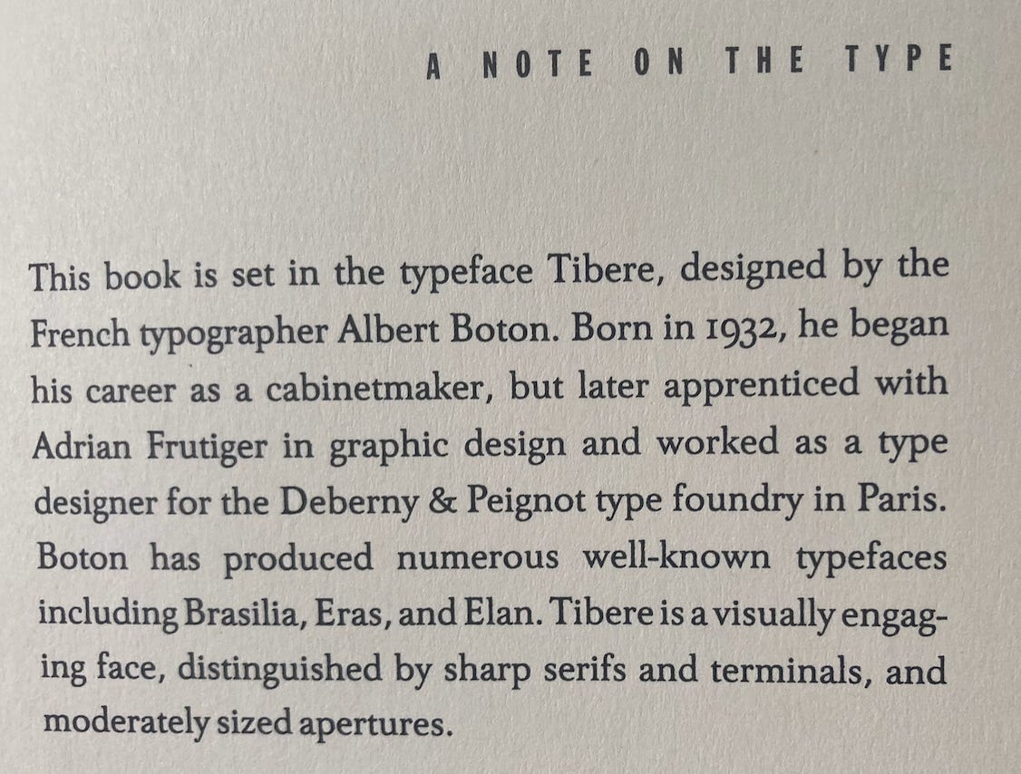
Back in week 2, we spent most of our time reading and writing about cabinet making, so it should come as no surprise that Tibere was designed by a cabinet maker’s son (there is some dispute as to whether or not Boton was himself actually ever a cabinet maker). As we dig deeper this week into this particular “A Note on the Type,” we’ll come to see that not everything is as it first appears. The sentence “Tibere is a visually engaging face, distinguished by sharp serifs and terminals, and moderately sized apertures” is, in fact, a description not of a typeface but rather of a human face, with the “sharp serifs” standing in for eyebrows and the “moderately sized apertures” standing in for eyes.
On one level, this subterfuge makes sense, coming as it does in a Tom McCarthy novel that concerns itself with questions like “how do we know that we know things” (the answer being: write a Great Report that encompasses everything there is to know or to possibly know about our era). It makes one wonder: how many more of these seemingly innocuous “A Note on the Type” sections are actually disguised messages? After all, it’s not like there’s a demand for these to be included in books. Would anyone raise an alarm if, say, the next novel by Ottessa Moshfegh didn’t include a “Note on the Type”? Who, exactly, are these for, and what darker institutional forces keep them alive? It must be obvious by now that the “audience” for these “A Note on the Type” sections is not the intended readers of these novels, but rather a second, secret set of readers, and perhaps even a more esoteric third set of readers.
Week 7: Calson
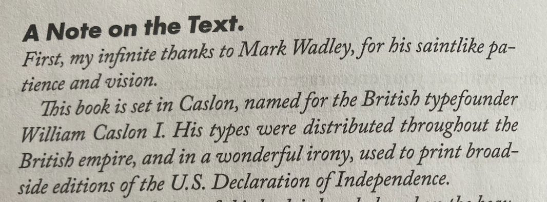
A looser, freer, more personal “Note on the Text,” perhaps the beginning of a trend to focus less on the biographies of the typesetters and more on the quirks of their legacies? Two oddities: first, the period after Text and, second, Text vs Type. A note on the Text. Clearly, this period is not a mistake. It is not an error, but rather a message to that mysterious third set of readers.
Week 8: Bulmer
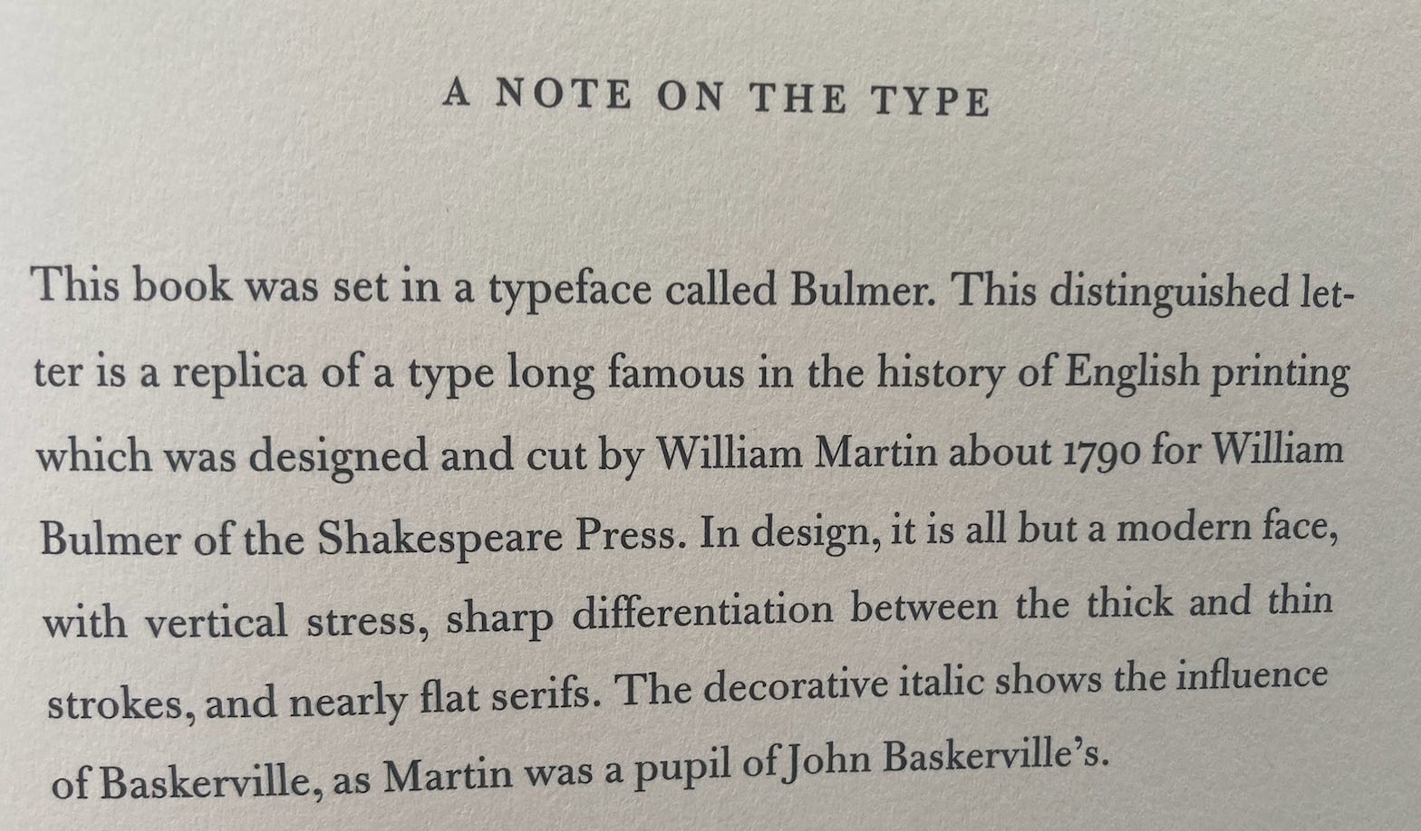
What is there to be said about Bulmer that hasn’t been said before? Cormac McCarthy’s The Road was set in Bulmer, which, we learn, is a “replica of a type long famous.” But what does this mean? The sentence seems deliberately obscure: Bulmer is “distinguished,” and yet it’s a replica of a famous but unnamed type. Does the “which” in the sentence (a relative pronoun?) refer to Bulmer itself or to the “replica?” And what about the phrase that Bulmer is “all but a modern face”? Why not simply “is a modern face”? What’s holding it back from being fully modern (“all but”)? In truth, this font reminds your professor of two strands from his childhood: the acrid smell from the overheated coils of fuse-popping blow driers and aerosol Aqua Net hairspray on Sunday mornings, as his sisters got dressed and ready for church, and the strange (dare he say shimmering?) view from the top floor of the old Commodore Perry Hotel in Toledo, Ohio, a view that suggested—impossibly—a city of enormous glass pyramids rather than buildings. Bulmer conjures all this and more.
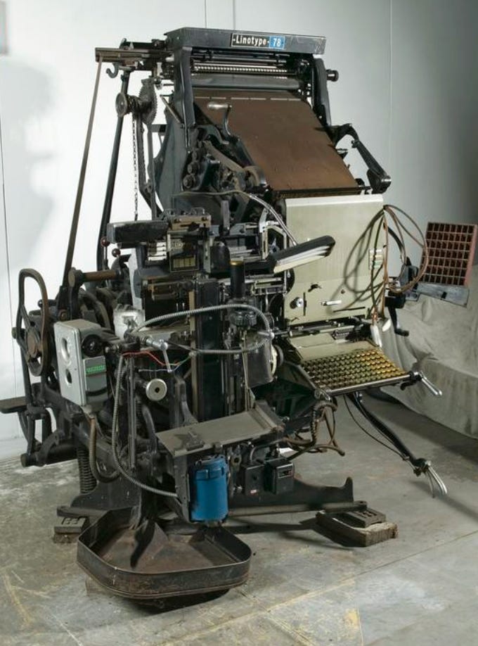
Week 9: The Machine
And this is where our linotype machine comes into play. We will have visited the linotype, three floors beneath the greenhouse, several times before week 9, but never actually put it into operation. To prepare for this, make sure you dress appropriately:
no loose or baggy clothing this week (this means no scarves, sorry)
nothing from Uniqlo (denim is okay, though)
no metal on your body; remove all piercings
no make-up (including vegan)
no shoelaces, if relevant
Because this syllabus is a public document, I can only say so much about what to expect once the linotype is up and running. If you’ve seen The Giant in Twin Peaks
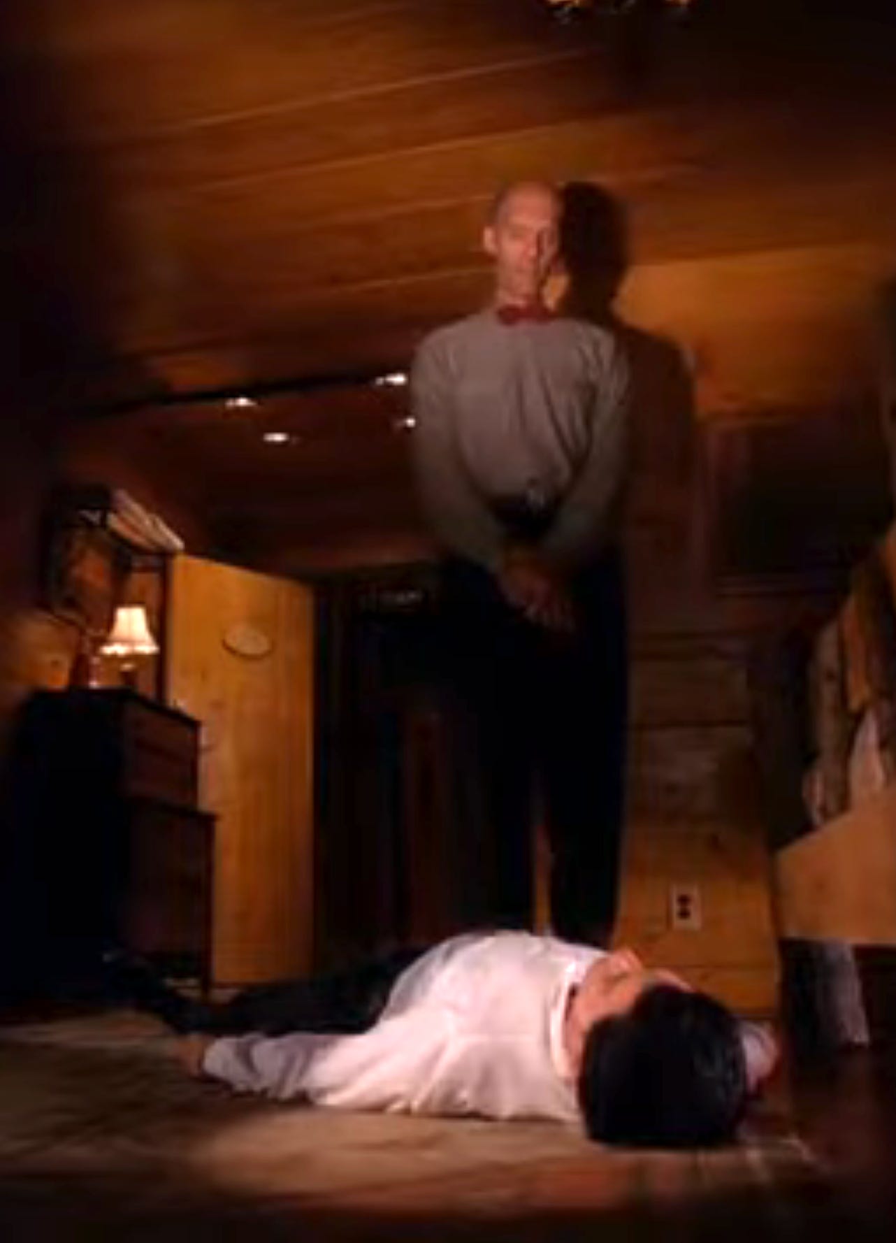
you won’t be surprised by the Very Tall Woman who, once the linotype is activated, will appear to help guide you through the complex, frustrating process of setting type.
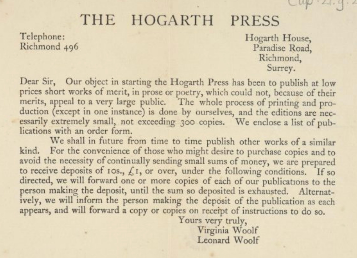
Warning: her hands are large, even for a giant woman’s. Warning: her voice comes in the form of the language of birds. She is, in all regards, a gentle giant who will help guide you through the steampunk intricacies of the linotype machine, whose ancestor
includes the Minerva platen printing press (in action, above, courtesy here), also known as the Hogarth Press (the video shows a version of the press Woolf would have used) the name Virginia and Leonard Woolf gave to their own small, in-house publishing company which printed not only Mrs. Dalloway but T.S. Eliot’s The Waste Land, in 1923, and which was hand set by Woolf herself, in a serif typeface, and which gave her no end of troubles. According to books specialist Lydia Wiklinson:
Eliot was part of the Bloomsbury circle – he and Woolf were friends and contemporaries. Woolf had difficulty with the typography because of the way Eliot would write, the rhythm and space used in his poems, and she had a bit of trouble getting the typeface right. In the end, Eliot was quoted as saying he was very happy with it. It's generally considered a success by Hogarth.
Week 10: Reflection
If you can’t outrun the darkness, students, you can at least keep it at bay through evasive maneuvers, such as this class. Like rabbits in an open field scurrying zigzag to avoid predators, by the time this course is over we will have dipped, dodged, and darted, keeping out from beneath the shadow of the Hawk that Must Come for Us All. I had a dream the night I began this syllabus. In the dream, there were all of you, my future students. Your brows were furrowed with worry, and because you were worried I was, too. But then I saw us here together, in week 10, having come through okay and just fine to the other side, out of the darkness and into the sun.
Obsessed with this whole series! I'm ready to go back to school.
Exactly the syllabus I need at exactly the time I need it